1


Isaac Bebbington

isaacbebbington@gmail.com
07762348549
iadb.cargo.site

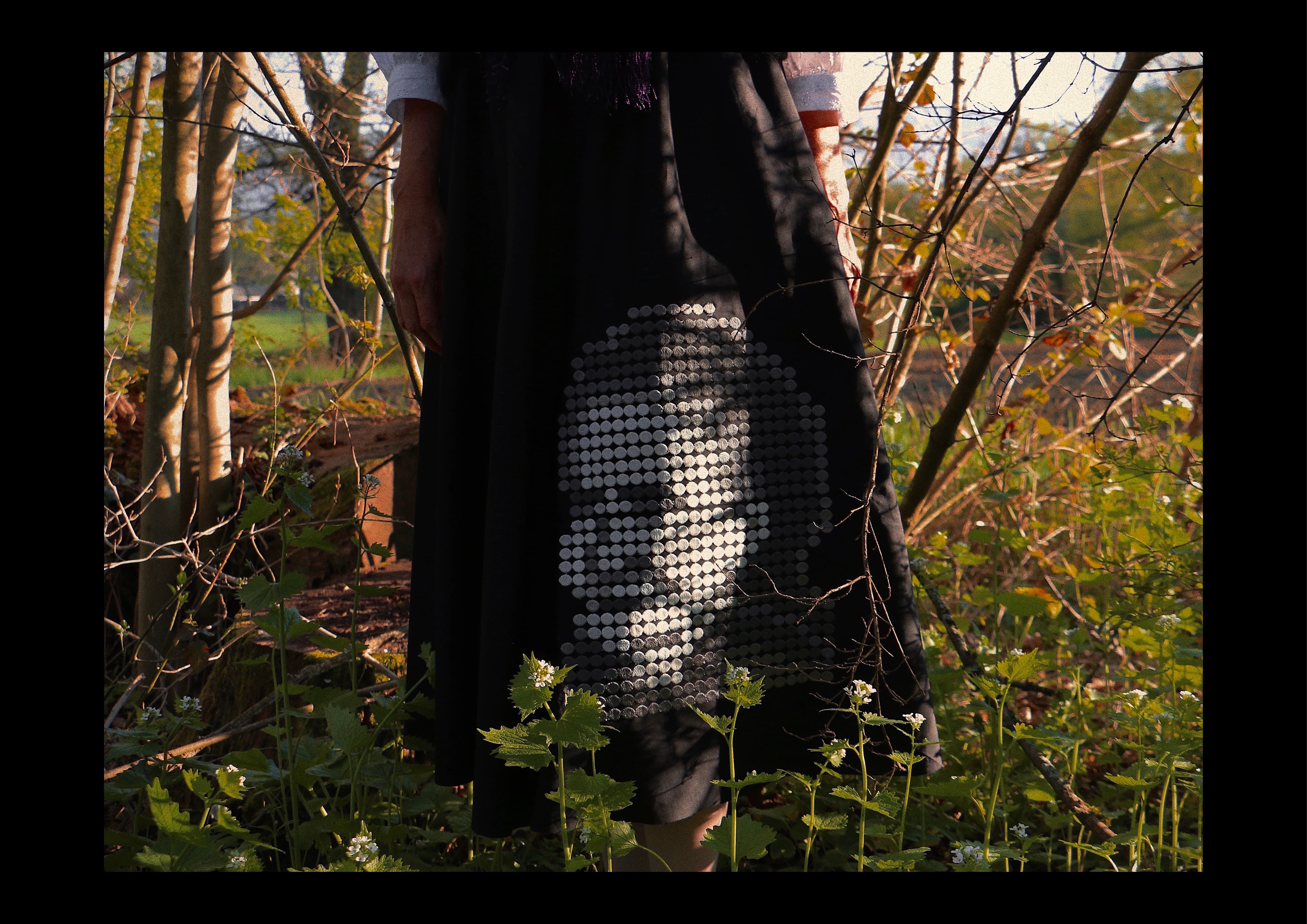
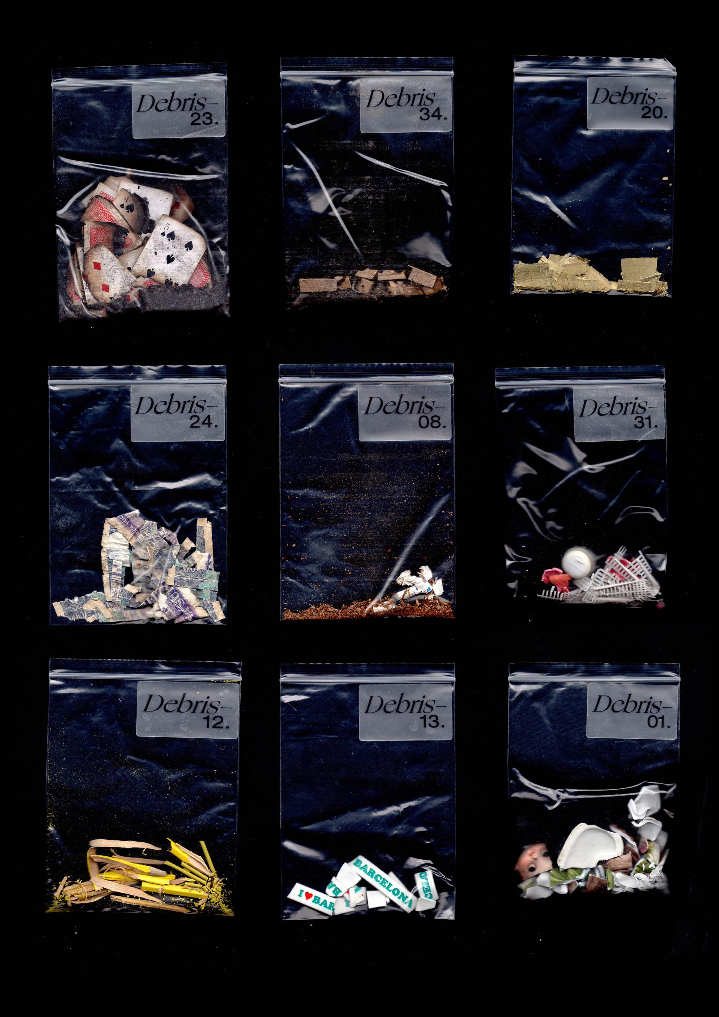
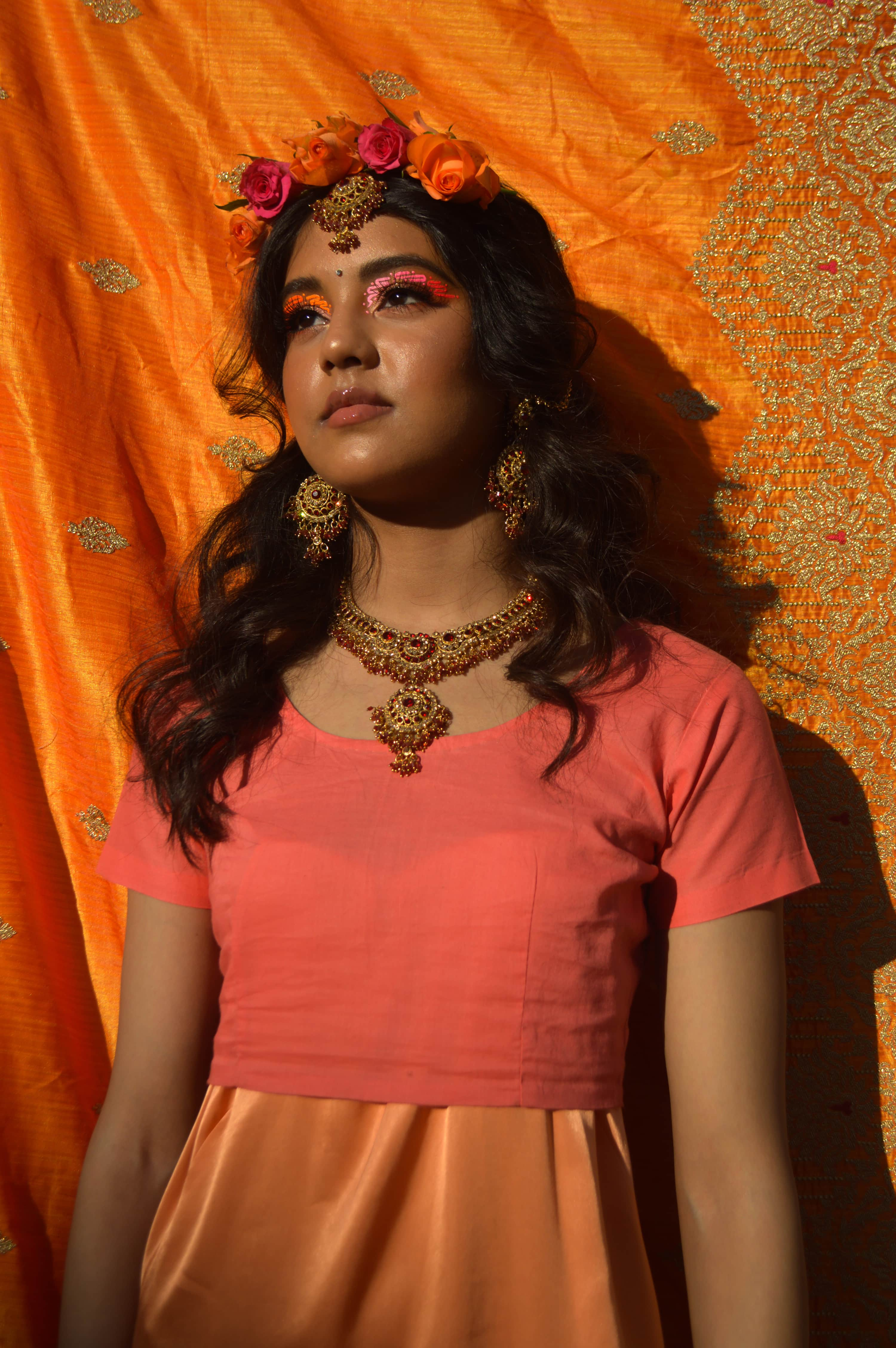
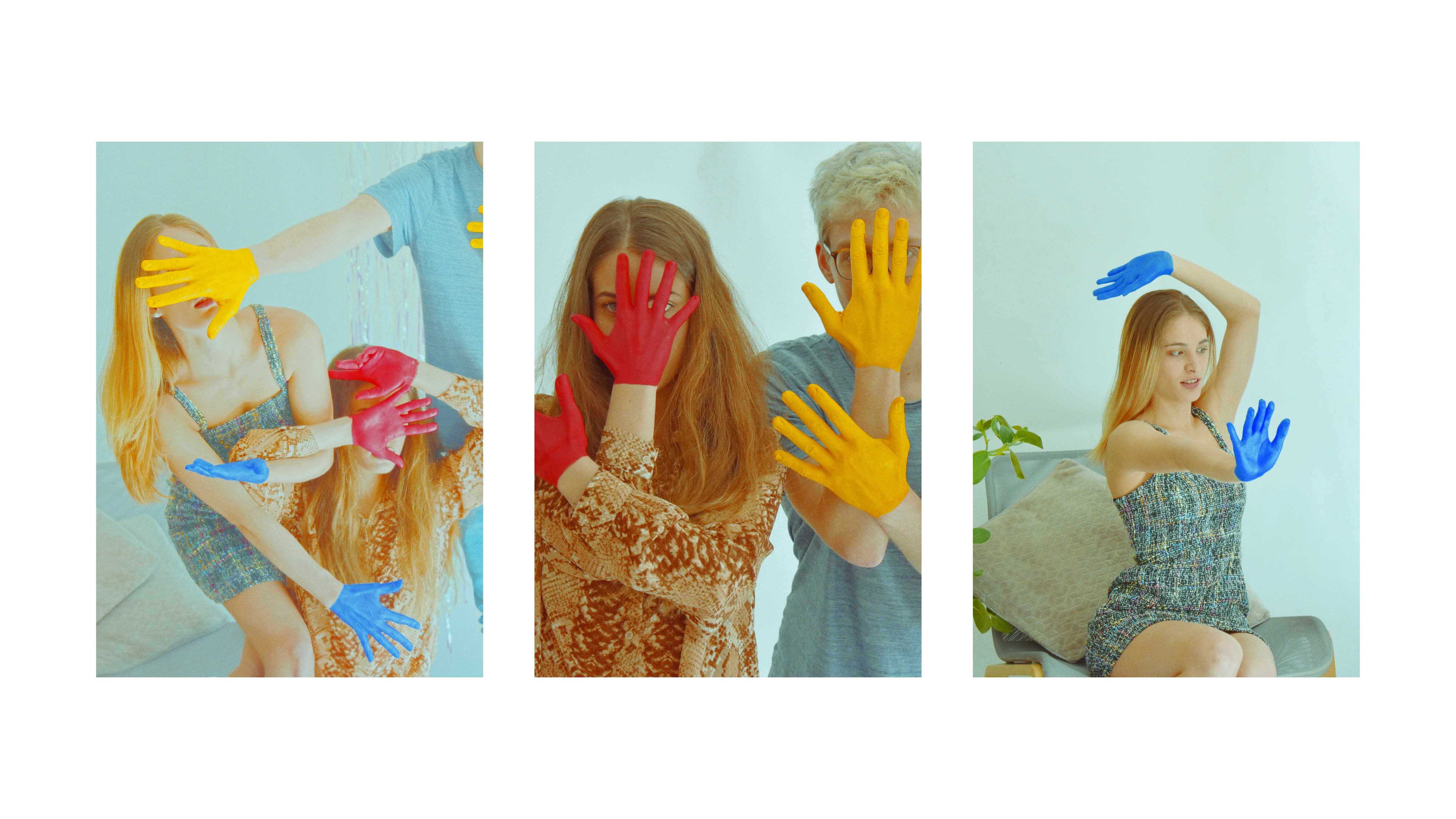
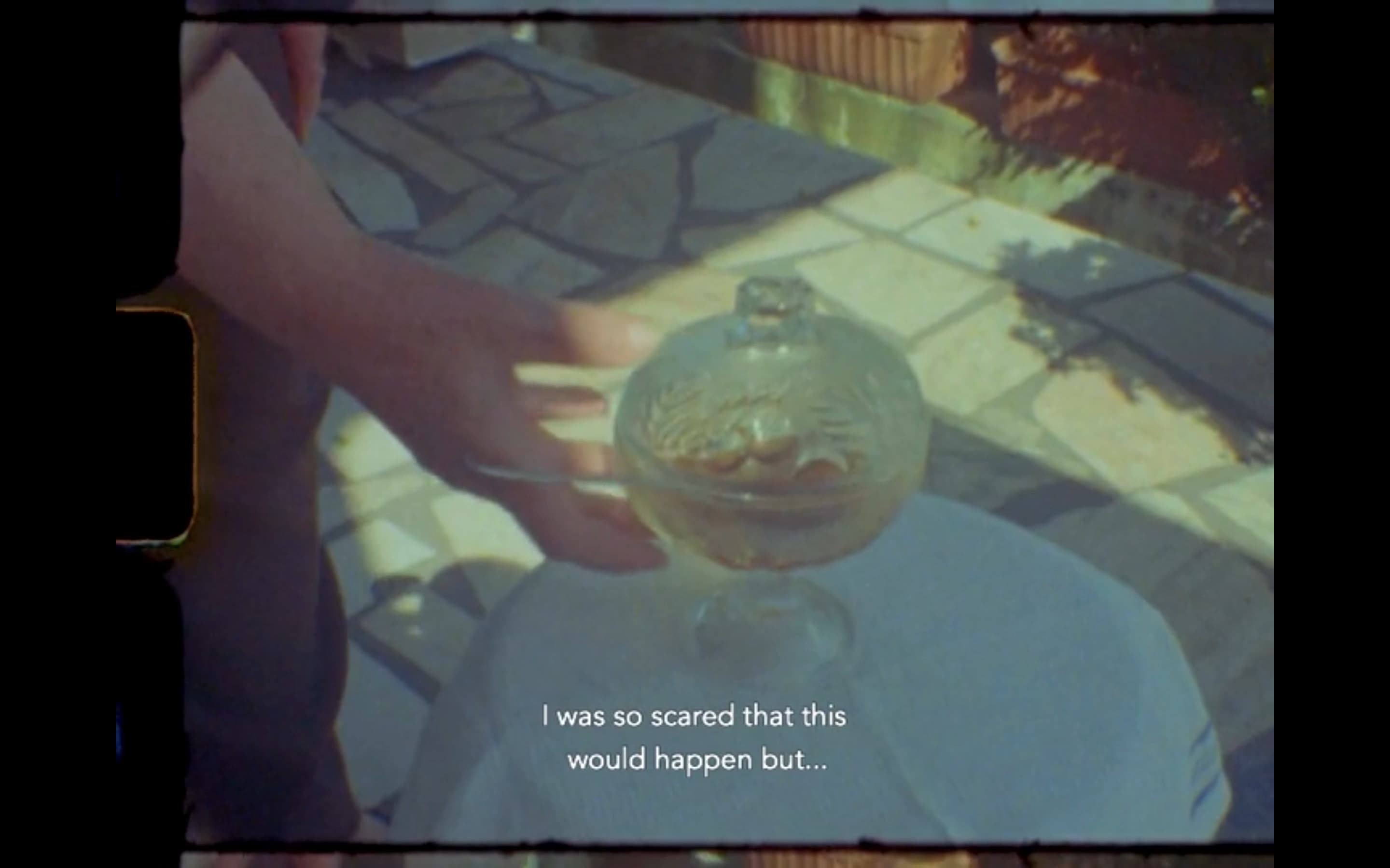
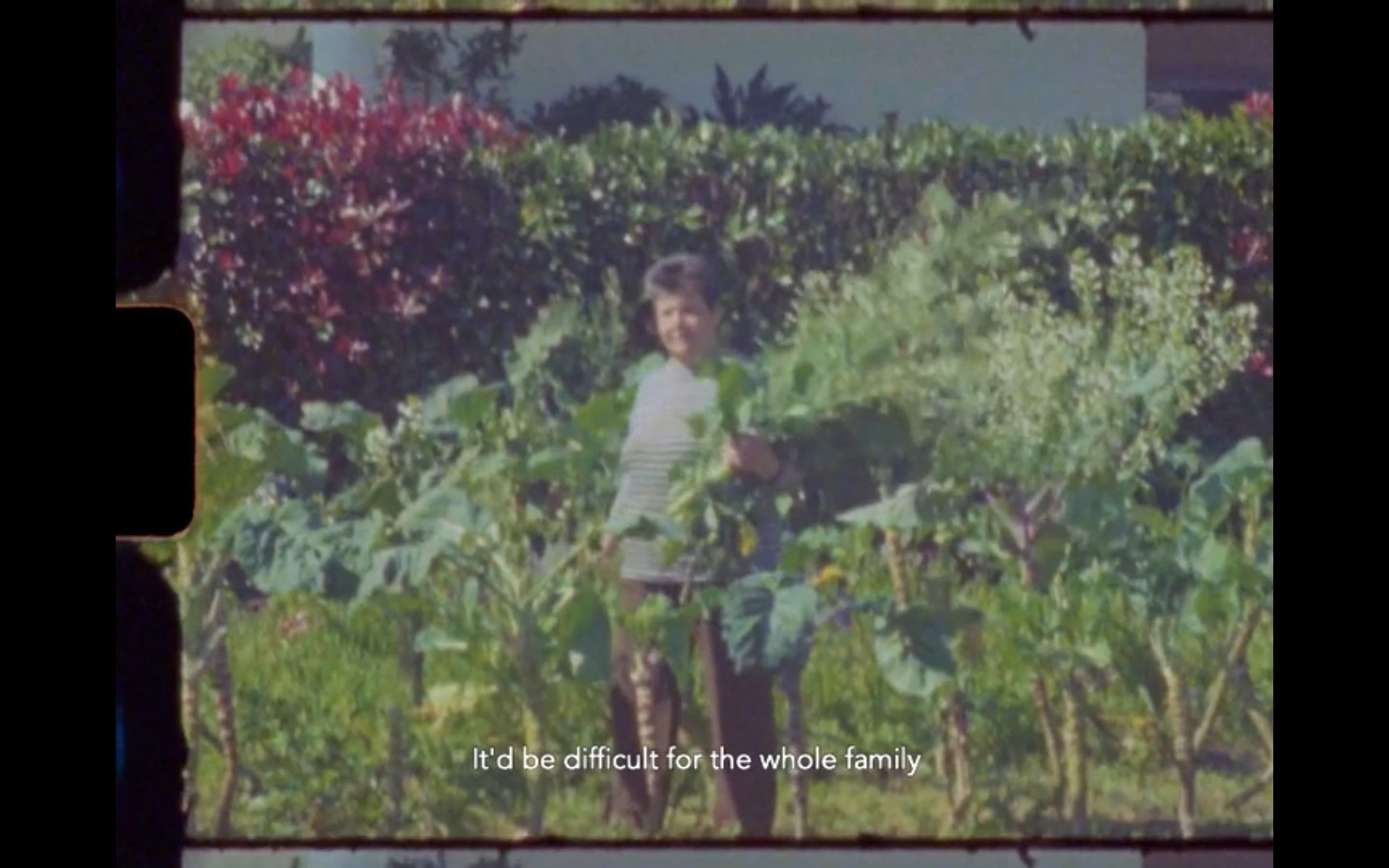
Silk, Bricks & Cylinders comprises a series of scenes recreating and reimagining stories experienced and recounted by my friends at home in Leicester. The film takes these tales of drug trafficking into a heightened hyper stylized world. The focus of the project was to collaborate with these friends through moving images and shine a different light on criminal characters. We did this through styling, art direction and cinematography. They are in a sense ‘day dreams of home’. Before shooting was completed we went into lockdown during which time I moved to New York, where I stayed for the remaining three months of term.  Whilst in New York, I found myself longing for the collaborative community in which I have thrived. This led me 
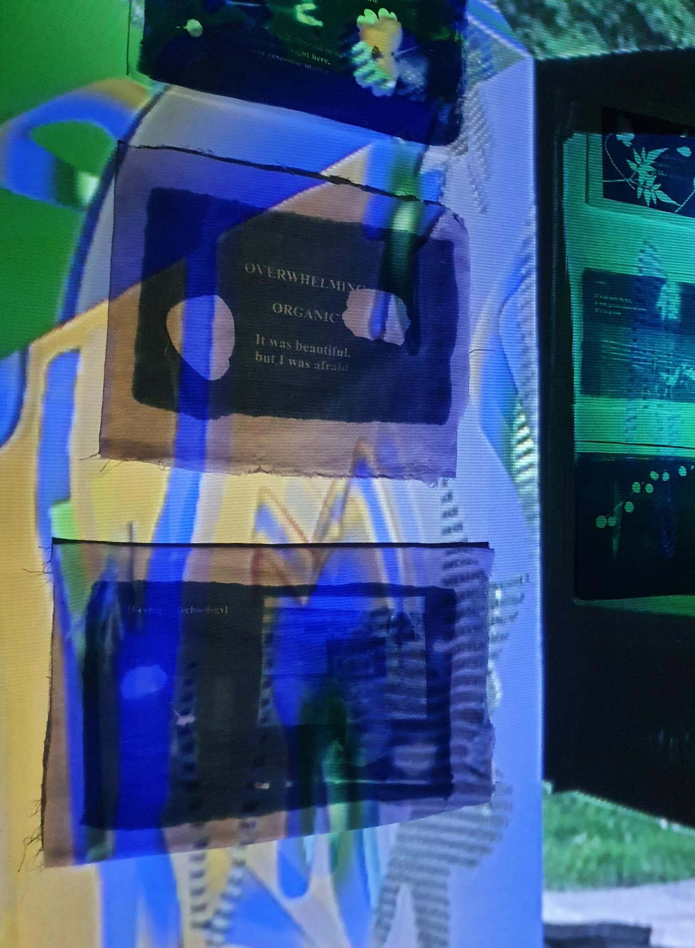
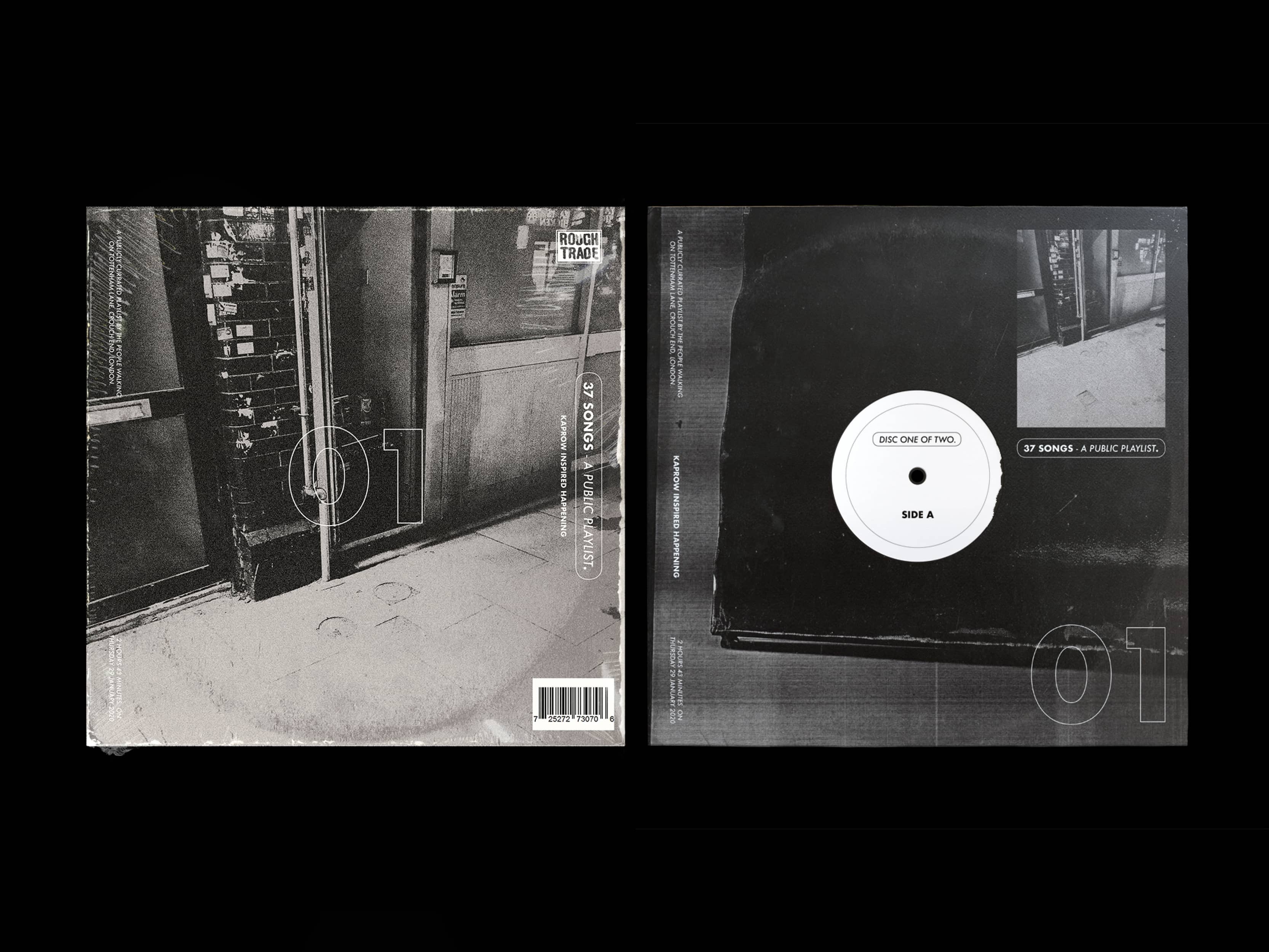
to pivot my efforts to focus on producing work for the design collective I am part of, Moncentral.

Founded in 2016, Moncentral has worked on political activism projects, held and contributed to design & music events and exhibitions in both the U.K. and Japan. We push each other to grow and excel through collaborations interweaving graphic, spatial and product design, film, photography and music production. With a 
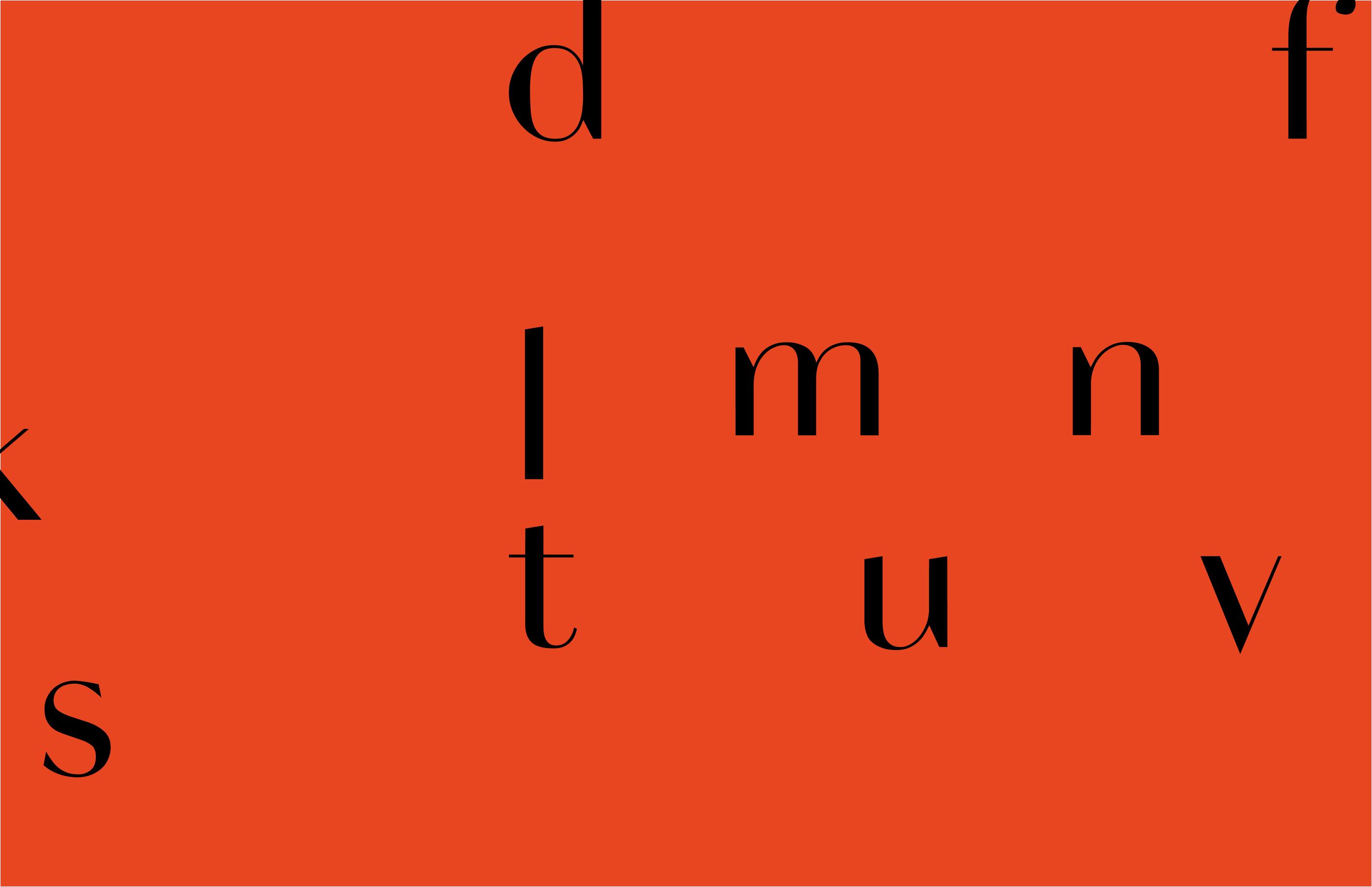
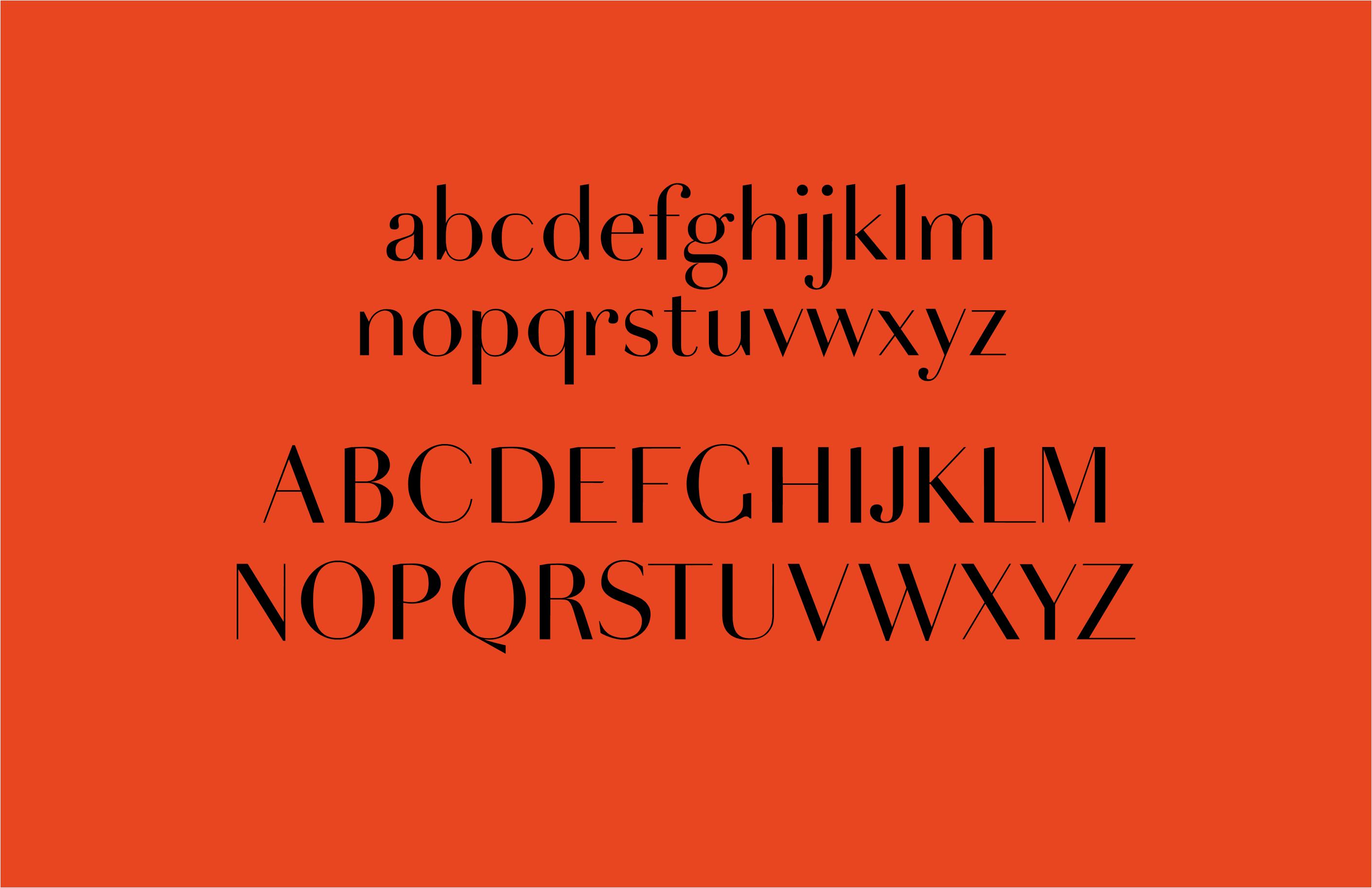
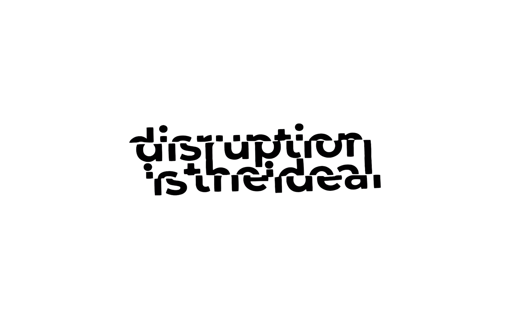
website in development, I designed a bespoke typeface to be used across Moncentral’s digital platforms and give the brand a visual identity. The typeface draws on the classic Parisian type family Didot, combining elegance and modernity, reflecting the collective's passion for beautiful design and innovation. I followed this with a 
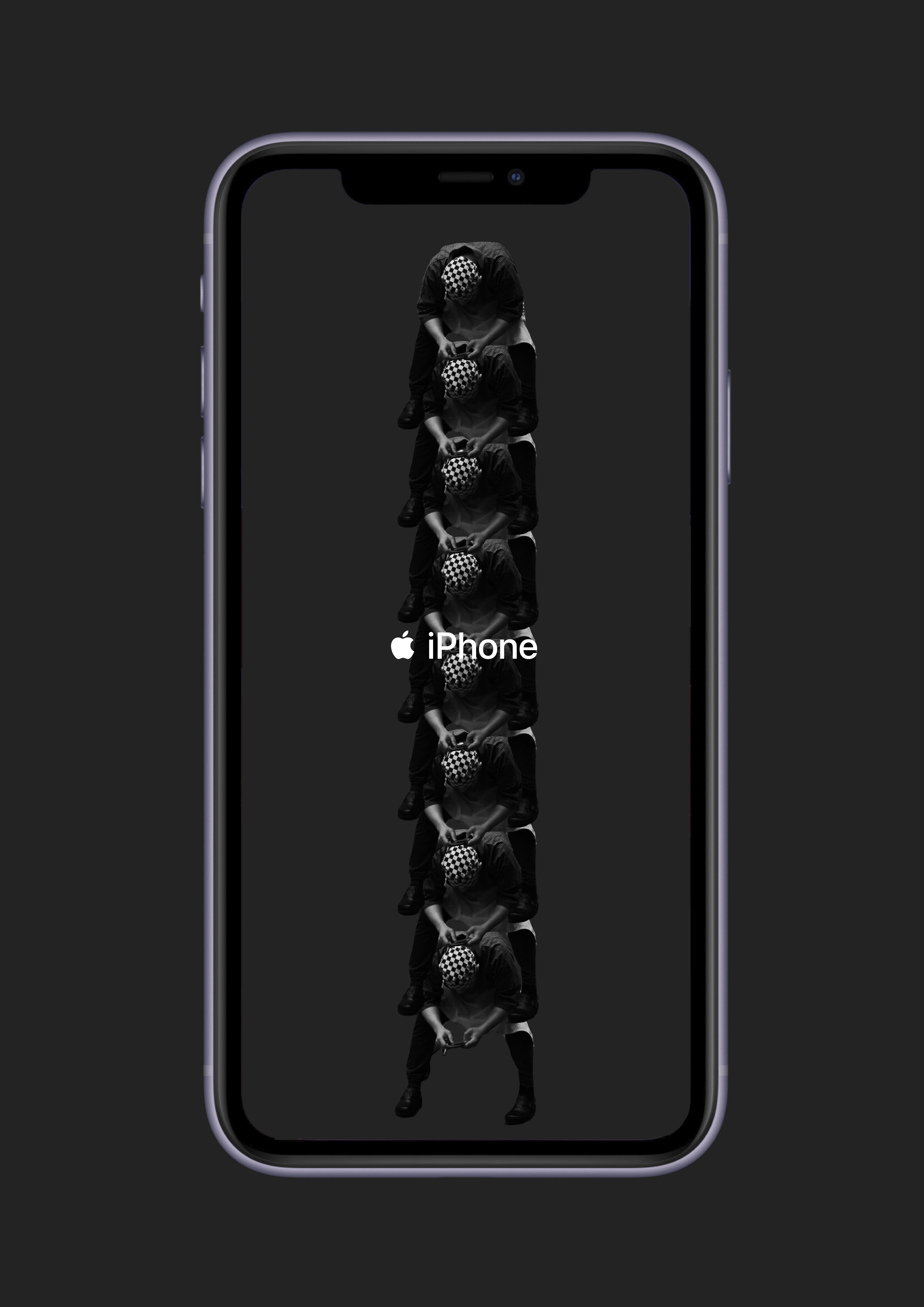
series of three idents; moving image pieces which encapsulate the collective's values and dedication to forward thinking, emotive and democratic design. The videos are sequences of Moncentral members playing football in inner city locations. The footage was then time remapped and coloured. 

port1


port2
land2

1


Hope Horncastle

hopehdesigns@gmail.com
@hopeh_designs
hopehdesigns.cargo.site

“BUYING FACE” is a project which explores the aesthetic of female identity; focusing on the role cosmetic surgery plays in our incessant desire to obtain beauty ideals often dictated by our obsession of celebrity, popular culture and social media. With cosmetic surgery more accessible and attitudes towards it more blasé than ever, theres no wonder it’s so sought after.  “BUYING FACE” explores this theme by merging supermarket shopping with cosmetic surgery. As today, with everything at our fingertips, shopping for a new nose is just as ordinary as buying a loaf of bread. With this in mind, NIP & TUCKSHOP was created. An online store for cosmetic surgery where all procedures mimic that of an everyday essential.

port2


port2
port2
port2


land2

1


Julian Lock

Julian.lock@icloud.com
@runamuckas
julianlock.studio

Marx’s idea of the commodity fetish is the notion of value in a commodity through its labour as well as exchange value through the social interactions a commodity gives through the physical exchange interaction. My brief is a cinematic documentation of the process & labour of my analog photography. Through the documentation of my process, as well as documentation of the initial reactions to seeing my final results of this labour, I am expressing to the viewer the concrete and abstract value within my work. I am also communicating the intrinsic value associated in the exchange as the viewer of the film is able to witness the initial reactions of the finalresults. The viewer of the film however, will never see the final results of my labour. This is my attempt at refusing to commodify. I do not wish for my work to become another commodity, circulating the digital world just as many other photographs are, being stripped from their concrete, abstract and intrinsic value.

Through using analog photography as my practice in this project, I am straying away from a digital world as many commodities of designers and artists lose their value as it cannot be properly portrayed through a digital realm.  Just as the idea of data ownership, I am claiming ownership through the presentation of my commodity to my chosen viewers, not allowing it to be viewed, or exchanged without my knowledge or consent. This brief is also a link to the idea of authenticity as the viewers are able to see the authentic original process of my actions and exchange. My film is split into three sections of my labour. These sections are segmented into the types of value inserted into my commodity. The first part of my film portrays the abstract labour of my commodity. The audience is shown my process of taking photographs, from loading film into my camera to taking the photographs I intended to show the passion I have in my medium of creating these photographs. This sense of passion and commitment is not an essential part of the process but shows my passion as an artist and designer. This is the abstract value of my commodity.This part I have titled ‘Passion’, this is in attempt to show my love and commitment to my labour. This labour is something that brings me joy which I hope in conveyed within the final outcome. The second part of my film shows my concrete labour and value.This is the labour of the process with is essential, without them, a photograph cannot exist. The development process of my film is shown as the viewer is able to see the skilled labour which is needed for these photographs to exist. I have titled this part of my film ‘Process’. The last part of my film is the exchange or intrinsic value. This is the presentation of my photographs to their intended audience. Thereaction is the exchange I intended for and to create emotion is the reason for my labour. This final part is titled ‘Present’. I am presenting my labour to my audience through its final tangibility, even if audience at the time are not witnessing my full production process, my abstract value is able to be felt by the audience as well as my commodity gaining value through its exchange. Through my film, I draw on film techniques such as quick cuts, transitions and close up shots to explore a long process in a short amount of time.There are a plethora of directors and film makers I am inspired by with these film techniques. Edgar Wright, a film director who uses fast cuts to speed up a series of character actions is a modern example of quick cuts seen in blockbuster movies. I am also inspired by smaller film YouTube makers such as Dan Mace and Casey Neistat use similar techniques in a vlogging scenario. Neistat and Mace use quick cuts to speed up his character actions, whether this is getting ready or traveling somewhere. This is similar to the techniques I have used as I am self directing which can be related to vlogging.

port2

1


Ruby Hughes

hughesruby37@gmail.com
hughesruby37.wixsite.com/mysite

The familiar smell of your mum's kitchen, the thoughts you have while you brush your teeth. These perfectly imperfect moments are what inspires my work. We have the technology now to create the perfect narrative of ourselves. Yet we are all humans who have chaotic thoughts and odd socks, I hope my work reminds you of that reality. Mistakes are a huge part of my practice, making mistakes has always fascinated me. Failing all my exams and struggling through education my whole life has made the idea of ‘mistakes’ and ‘getting it wrong’ a big part of my journey. Throughout the years I’ve realised mistakes are how you learn and are incredibly important especially in my creative practice. The ironic thing is this idea has fuelled the inspiration behind my visual language, my work has done a full circle and the foundation behind my work has ended up being about imperfections and getting it wrong. We are a society of trackers constantly organising, filing and tracking our steps, progress and productivity. I worry this is leaving no room for error, which is a big part of the journey. 

Technology has allowed us to become a society of trackers. How many steps we take, how much we eat, how much we look at our screen, how much we spend, how much we digest information, and so on. Monitoring our movements, plans, intakes and interactions. The interesting part of this to me is the part we can’t track. The distracting thoughts and chaos we have in our heads. No matter how hard society tries to push us to document and categorise everything. I believe this part of our every day is sacred and should be cherished. I wanted to create a piece of work which not only comments on documenting this but also highlights the chaos which can’t be tracked. 


port2

1


Matt Tam

iMatthewTam@gmail.com
@matt.tam.creations / @maskmessages
behance.net/matttam   

Project Description:  I started this project by exploring the idea of stimulating an optimistic mindset through graphic design. When the pandemic hit, it completely redefined my brief, now with the purpose of finding hope in difficult times. ‘Hope Is Out There’ is an illustration that celebrates the work of frontline healthcare workers, who continue to risk their lives out there fighting a battle with the virus, while we try to lighten their load by staying at home. They are truly the heroes that children should be looking up to. 

Project Description 2:  This project originally started with messages written on face masks, as a way for myself to prevent anti-Asian racism in public fuelled by the COVID-19 pandemic. It eventually developed into wire decorations on masks to spread positive messages during this difficult time. 


port2


port2
land2

1


Maya Kubota

-->

mayakubota@outlook.com
@maya.kubota
maya-kubota.com 

I have an obsession with collecting miscellaneous tangibles. In my collection, tangibles refer to materials that do not have digital intelligent elements. Animism and reincarnation are spiritual beliefs exist in my culture which influences my process and concept of my work. Biographies of Objects is an online platform encouraging audiences to interact and contextualize objects. I create three ways to contextualize existing material. The first one, Represent, is a way to categorize and show the object in non-monetary value and non-functional approach. The second method, Retell is where the story and the meaning of the object told by the owner. Lastly, Repurpose is a method to discover, record and give a new meaning to abandoned objects. Throwing away materials are considered as guilty to me. Therefore, I tend to repurpose existing physical materials.

 Lost & Found is a digital archive of lost objects that I collected around London. Audiences can create their own archive on the website under Create page. This is giving a new meaning to the lost objects. Participants can also collect and share lost objects on Share page. This is a new system to store the objects. The system by Transport for London is a failed system since less than 25% of the objects are collected in 2019. These objects are eventually sent off to an auction or thrown away after the ‘expiry date’. The manifesto can encourage and guide the audience to collect lost objects. I believe that by sharing the object digitally, it would help to find the owner. Memorabilia is supposed to be my second project. This is about celebrating sentimental objects and the narrative through photography.

Due to Covid-19, I start a podcast, Show & Tell interviewing people to tell a story behind their sentimental pieces. Each object represents different aspects of the speakers. Some of the stories are about relationship, childhood memory and culture. The podcast can be found on the website under Listen page. Collecting existing materials allows me to explore new themes and experiment with various media and technique.I believe that it is almost impossible to create something completely new from scratch, therefore I use whatever materials I found around me and renew or reemphasize it. Embracing the process, creating and breaking a system is my approach to keep making and designing various outcomes. 

land2
land2
port2


port2


1

1


Mabel Xiaotong Chen

xiaotong1011@gmail.com
xtongchen.cargo.site 

My graduate project is a continuous investigation into tangible information design.  In modern data systems, I have observed how data visualisation has evolved into a tool for pushing one party’s agenda. As a designer, I would like to challenge this power embedded in the systems, and involve the public in the design process to democratise data and evoke honest representations. In this digital age, data is seen as cold, boring, merely 0 and 1s. Contrastingly, the world where data stems from is so beautifully diverse; bursting with vibrancy and life. To challenge this preconception and give warmth to data, I create tangible representations of information. I utilise physical experiences and human touches to communicate data.  In my work, data leads to the design, rather than the designer.

During the process, user participatory is essential, as their inputs shape the design while increasing its reliability. The designer creates a platform and a framework to facilitate people’s voices to truly represent data.  My exploration into different facets of information includes spatial data, emotional data and data from objects. Furthermore, my tangible information representations express the complexity of data. Using and layering three-dimensional structures shows the relationships between my data subjects, such as space, humans and objects. Mapping data into tangible representation helps us to truly experience information from a brand new viewpoint. Data informs design, and design enhances our reflection of life.


land2


--> land2

port2
test

1


David Frame

dvdjframe@gmail.com
07881296154 

Underused by social designers, comedy has the unique capacity to provide critical analysis and disruption of social issues to everyday audiences. By making social topics engaging, accessible and convictive, humour is becoming an increasingly valid and reliable tool within activism and social design. My showcase demonstrates this use of comedy; specifically exhibiting how comedy can be used as a delivery mechanism to engage audiences towards socially-motivated messages. ‘Why you Should go to the Cinema Alone and How to do it. (Seriously).’ is an article that humorously advises and dictates the reader as to how and why more of us should be going to the cinema by ourselves. Using comedy to engage readers towards socially-motivated messages, the written piece promotes the practice of self-care and mindfulness. Please take a read for yourself.


1


Beatriz Gonçalves

beatrizcarneirogoncalves@gmail.com
07874361238
 @nochillbeatriz
beatrizcgoncalves.com/

My work is often personal as I’m mostly interested in the exploration of intimacy through film and what results from the connection between myself and my subject.  One of the most important things to me is to be able to express the essence of my persona, as well as my perspective of the world around us.

As an aspiring filmmaker, I am passionate about real people and real life stories. I am keen on expressing emotions and feelings through film;  I believe that it is increasingly important to make work that is not superficial but to create more meaningful work that has an impact on people and therefore causes a questioning of more profound problems and ideas. My work has an experimental inclination and I am mostly interested in experimenting with analogue techniques and non linear narratives. It turned out very different than what I expected and I had to improvise a lot but the challenge made me realise that my mental health was more important than any college project and I should not put too much pressure on myself. I had a few breakdowns and changed my idea a hundred times until I could make it work. The whole process was harder than I expected and it definitely taught me that there is no point in stressing out if things don't go as planned - at some point I just let it go and forced myself to accept whatever came out of it."In a time where the world has been hit by a global pandemic, I capture my grandmother’s fears and worries through phone calls during the lockdown. Through the fear that came with this uncertain period of time, she remained lighthearted, loving and funny over the phone. Shot prominently in her house, in a secluded corner an hour outside of Porto she goes about her daily chores, tending to chickens, gardening and preparing food.  Shot on 8mm before and after the lockdown in Portugal." A few notes on my experience doing this film: The project totally changed due to the circumstances. I was ready to shoot my grandmother and her sisters back home when suddenly lockdown happened and I was almost forced to make a film from home. I ended up using the footage I shot a few days before lockdown and recorded calls with my grandmother and make it all about her.


port2


land2

1


Ellen Powley

eagpowley@gmail.com
07572435764
ellenpowley.myportfolio.com/work

“The Covid-19 Cookbook: Digesting the Pandemic”, takes the form of a recipe-journal, to discuss the various ways that the pandemic has impacted our relationship with food. Stemming from the project’s focus on comfort food as a form of self-care, the publication presented the opportunity to document any thoughts and feelings surrounding the current climate, using food as the conversation starter, encouraging readers to appoint the preparation and eating of their favourite foods as a coping mechanism. This enabled an exploration into food’s ability to ground and comfort during times of crisis, as well as a discussion of the various topics of food surrounding the pandemic, including food shortages, food waste, stockpiling and how food is affecting our relationships with others.

land2
port2

1

Minrong Chen &

Cynthia Meng

longlong011198@gmail.com
cynthiameng22@outlook.com
minrongisuserdragon.farm/   
mengcynthia.com/ 

We imagined that the future development of technology has the potential in helping to solve pandemic situations, similar to the one we are facing currently; by separating our minds away from our physical body (especially when it is de-functioned). This future possibility challenges our way of living and our understandings of the relationship between body, consciousness, and identity. 

“Self depends on consciousness, not on substance ... personal identity consists: not in the identity of substance, but, as I have said, in the identity of consciousness” ---- John Locke

Our narrative was developed from this concept. We hope the viewers could enjoy the visuals, while think about how will you choose between your physical body and entering a virtual space with your conscious mind?


1


Sarah Ehmann

@villeneuvecookbook
Newsletter

My final project is in 3 parts which work together :  
1."From my terroir, Sincerely, Sarah" the diary   
2."@villeneuvecookbook", my instagram  
3."Villeneuve Weekly", my newsletter 

1. From my Terroir. Sincerely, Sarah is a publication, a diary of my time in confinement. It focuses on how I’ve linked with my roots again, my « terroir ». Terroir is a term central to my work, unique and particular to French language. It combines the concepts of ground, soil, climate, food specialities, folklore and culture, and creates this individual and unique identity we call Terroir. During this confinement time, focusing on food became what gave rhythm to my days. I quickly sought out to learn from the community that surrounded me, trying to make the most out of the situation. My mother assigned me to different house tasks, at the same time she taught me different cooking techniques. I also had the pleasure to visit different farmers and producers, neighbour baker and had time to have long discussions with my (farmer) parents who have this shared love for the soil and accordingly the produce able to grow from it. Those exchanges were a real turn in starting and all throughout shaping my work. From there came the interest in the concept of Terroir. I was then inspired by the project «With our own hands» ,which is one of my case studies in my essay, in the way they documented this communities’ food traditions but also their stories, rituals, struggles. They captured an identity in the form of a book and photographs. That influenced me in the choice of the format my diary was going to take. My diary acts as a log of this valuable time in confinement where I was able to take time in reconnecting with what I hold dear. It is a combination of carefully taken photographs that aim to reflect the area I come from, and is laid out in a way to leave room for the visuals to talk for themselves.

2. Villeneuve Cookbook is where my project starts from. It is an instagram account I started during the first days of confinement when documenting my routine became a way to keep track of time and also to keep motivated and sane. It was my first experience with sharing my passion for food in such an open field. It started as an unidentifiable profile and then, as I shared it with my friends, I got asked more and more questions on techniques and recipes. They could recognize my touch. But It was the interest from strangers which was even more gratifying and that made me curious and eager to share more about where I’m from. How they would relate to it and engage with it was something that interested me. I noticed that sharing these photographs and thoughts was a way for me to show what makes the essence of the place I come from. Amidst this, I was also able to show my true self a shared love for « good, clean, fair » food as Arnaud Daguin, a famous local chef says.

3. Villeneuve Weekly is a newsletter I started as a result of the many responses I had from sharing my new daily fabrications on social media. It was also a direct response to being confined, letters seemed like a perfect way to communicate. As I kept seeing inspired my the produce and people locally and on social media, there grew an urge to share more thoughts and stories on the topics of community, terroir, agriculture, food, books …etc Sending a newsletter was for me the best way for people to engage in these shared topics. Instead of just stumbling upon a page or a website, people signed up to receiving a weekly letter, I could see who they were, so not just a stranger passing by and reading my deep thoughts. Villeneuve Weekly quickly evolved into a platform where I shared other people’s contributions, that part for me was the most interesting. These last two projects are ones I want to keep feeding and where I have established real links with a community through exchanging recipes, stories, thoughts and then results of those. Through this last step in my outcome, I was able to shape my research question which clearly stated the aim I wanted to give to my work, that is community engagement, building and giving the kick to build a community through a shared interest in Terroir.


land2

port2
land2

1


Andrea Cheng

andrea.cheng.628@gmail.com
andreachengg.myportfolio.com/home

Welcome to the Museum of Sleep, we wish you a good night with soothing dreams and a peaceful sleep. An unconventional package of solutions for those who suffered from insomnia.

Begin with the three-dimensional booklet, The Museum of Sleep, which provides museum-like corner spaces in the booklet with not only scientific and food knowledge about sleep but also poems about dreams visualised by fantastic illustrations. The physical booklet turned out to be full of volume and texture. Each page is a gallery or exhibition room that provides an immersive experience to the readers, and there are cut-out parts on every page that carry hidden messages and information about sleep and dream.

A printed blanket is included in the package dedicating to provide physical comfort to improve one's sleeping experience. One side of the blanket is the rearranged illustration of the Sleepy Food Gallery, the other side is the illustration of the starry sky and the star signs.

The animation is about the starry sky, star signs, and moon cycle, which is an idea of mimicking how human beings fell asleep under the night sky naturally in the old times without the roof. The animation can be projected on the ceiling in the reader's bedroom to provide a better and more welcoming sleeping environment.

port2

port2
land2

1


Jess Minying Li

jessli14@outlook.com
wavycircle.com

The U10 project splits into two parts: 1. Collage series - Digital Neighbourhood and 2. Customising add-on applications for messages - type~face. 

Digital Neighbourhood

This series of collage is a result of the documenting-based photograph I took in central London, the purpose was to observe and document how we interact with smart devices nowadays and reflect on whether we are over-adaptive on them. Behind the photography, the intention of observing our interaction with the devices is to think about how human behaviours are changing by digital tools, for instance, we are using more emoji and short words in communication because we are adapting to the texting conversation. And changes like this might not be visible for us. Technology is reasonably developing for providing more conveniences for users, but do humans necessarily ought to be changed by it?

type~face

An add-on designed for visual customising while smartphone users are having conversations through texting. type~face intends to offer more freedom for the users to design their messages, at the same time, leave space for reconsidering the meaning of the contents we type in. As we live under the environment of rapid information delivery, the more convenient the tools are, the less time is left to us to think, and the information we present becomes less precise. On the other hand, providing visual design for users to present their ideas is existing as a role of 'vibe' in real-life conversations in this solution. In actual conversation, we rely on more than words to deliver information. The thoughts exchanging by non-verbal ways such as facial expressions are normally abstract meaning and emotions. As such a part of communication is lacking in the digital world, the thoughts we deliver could be less precise. Especially under the pandemic background, technology is undeniably offering more advantages. type~face is trying to find the balance between remain human sense and independent thinking and the user freedom we have in the digital world.

port2
port2
port2


port2 port2

1


Amelia D H Tovey


ameliadhtovey.com

Etsy

I like to describe myself as an environmentalist first, and then an illustrator. It’s through this lens that I approach my design practice. When it comes to the climate crisis, heavy statistics can often be difficult to relate to and connect emotionally with, and the overwhelming volume of information that is encountered and consumed within the internet age has been theorised to develop into 'Compassion Fatigue’ (Carla Johnson); a desensitisation to shocking information; and a 'cognitive dissonance’ to act upon impulse. I believe that taking a step away from this statistical approach we could help create the opportunity for an audience to connect more deeply/ emotively to the environment.

For Project 01, I turned to folktales and folk arts from around the globe to offer a rich context for my storytelling, as I aimed to create a hybrid tale that was inclusive of many different cultures - hoping to connect deeply to a wide audience. I aimed to draw upon these folktales and traditions as a way to evoke strong emotions rooted in a sense of identity or empathy, ultimately resulting in a passionate desire to enact change. I began with the following questions in mind: Which stories will we be telling to future generations? What will they say about us? In which environment will they be when they hear these stories? Exploring environmentally conscious image-making, my illustrations took the form of Collagraph prints – a technique of creating printing plates from recycled and waste materials, and printing the textures. The final outcome for Project 01 is a book named FOLKTALE FOR THE FUTURE, designed to be so large and so heavy that one person alone will struggle to read it. It requires a community of readers, much like the climate crisis will take all hands on deck to solve. Intended for a large audience, the concertina measures 11.4 meters long. Do you wish to continue down this road?” On the other, is a green, positive vision of the land-scape. In the fore-ground, the desolate fields have been re-wilded with local flora and forna where butterflies and bees thrive, while an over-grown road leads the reader to an ecotopian community that is decorated with sustainable energy sources. I took much of my inspiration from the ‘SolarPunk’ movement, that has been described as the ‘next instalment’ to DieselPunk and CyberPunk. SolarPunk visions depict a positive vision of the future, avoiding dystopian fear-mongering and colonial narratives, favouring an inclusive, sustainable society to offer a ray of hope amongst main-stream narratives on climate change that are, overwhelmingly, negative. The roads in both images carry symbolism for the new time: we have reached a cross-roads. Myriad choices and chances have lead us down the road of mass extinctions, sea level rise, increasing extreme weather, and now a global pandemic. As a society, we must accept that the old ‘normal’ was never sustainable, and that this terrible circumstance is an opportunity to reassess how we want to design the future.

In Project 02, I document my first-hand experience of environmental change - within the context of a global pandemic - and how this uncertainty has taken affect. While it’s common in popular speculative fiction to explore environments in outer-space (often sci-fi narratives have humans moving to mars or travelling and colonising the universe), this speculative project explores ‘inner-space’ - introspectively navigating my local and imagined environments during uncertain times, and under restrictions, watching environmental changes on a micro level. Through the medium of natural pigment paintings, I create a graphic novel style journal named BEYOND THE PARAMETER that theorises four stages of experiencing environmental change: Up in the Air, Claustrophobia, Adjustment and Escape(ism). The book ends with a double-sided pull-out poster, allowing the reader to choose their ending. One one side, is the scene of forest fires and sea level rise; PPE litters the waves, while a refugee boat sinks. ‘Diamond Princess’ Corona cruiseship waits; Smoke smothers the COVID-19 filled sky, and above that, communities can be seen floating away in brick houses to occupy the craters on the moon, and a rocket can be seen drifting off to colonise mars. In the foreground, the dual-carriage way turns into a giant serpent, who looks directly at the reader as if to say “This is where you’re headed. Will we try to resume what was before, or will we have adjusted to the slowed-down pace of lockdown and will be searching for alternative and sustainable ways of doing and living. The design choices in these projects were made with environmentalism and responsibility as a priority.


port2
land2
port2

1


Kate Wixley

katewixley@yahoo.com
katewixley.com

Project Website

My name is Kate Wixley and I’m a multi-disciplinary designer from Cape Town, South Africa. Although I’ve pursued a degree in Graphic Communication Design from Central Saint Martins, I specialize in merging visual communication with textiles and print. As one uses print and aesthetics as an extension of their own visual identity, I want to use this medium to start a conversation and connect to individual experiences of the world. 

The Home Screen records the childhood of the digital generation, in miniature, giving one a virtual tour of the digital ‘good old days’. This is illustrated through an interactive historic tour of a doll's house, which uses obsolete digital technologies as inspiration for the interior design. 

As periods of intense change are paralleled with heightened trends in nostalgia, The Home Screen visualizes this through the interior style, merging Victorian interior revival and obsolete digital technologies. By merging two forms of physical nostalgia, from two technological time periods, a nostalgic visual style is created. Dollhouses have been used throughout history to reflect the lives of the owners and makers, and The Home Screen serves as a visual record of how deeply technology has become embedded in modern daily life.  The tour, script, and wallpapers were designed by Kate Wixley. The Home Screen can be interacted with on its website, designed for browser viewing. 

land2
test
port2

1


Clelia Anchisi

cleliaanchisi@gmail.com
@hazymu
www.hazymu.com

Helvetia

“Helvetia” is a project celebrating and exploring the meaning of 21st century Swiss national identity through visual communication. Swiss Style, being an integral part of 20th century Swiss visual communication, has been used as a tool in this project, and reinterpreted in order to covey emotion and discus various Swiss realities. 

In order to address various narratives and themes relating to Swiss identity, the Helvetia project consists of 6 projects. Each project opening up a discussion of where Swiss national identity lies when linked to history in order to truly represent a modern 21st century Swiss national identity that can grow from its past.  “We know better where we go when we know where we come from.” 

6 Sub-Briefs:

Project 1

Coat of Arms

Exploring regional identity through revitalising the 26 canton coat of arms flags. Introducing a modern twist, focusing on geometric symbolism through the use of small circles, representing unity and the many entities that make up a community. Circles will be a reoccurring symbol within my body of work. Circles represent a cycle of history always rewriting itself, a more dynamic reminder to keep pushing for change + for a better future. These flags could be integrated on official Swiss documents, or as QR codes redirecting the user to a cantonal website.

Project 2

The Dress of the Women Less Heard 

Exploring Swiss socio-political identity in regards to women's suffrage.

Swiss women obtained the right to vote in 1971 however, women of the canton of Appenzell Innerrhoden had to wait until 1991 to vote locally. Women’s voices were disregarded. As a modern symbol of history rewriting itself and power, the face of Marie Goegg-Pouchoulin (1826), the first Swiss feminist, pioneer in the women’s rights + peace movement and founder of l’Association Internationale des Femmes, made up of circles is embroidered onto fabric transformed into a traditional folk dress, worn by women in the past.

Project 3 + 4

Stamps + Transport Textiles

Stamps

Exploring visual + design identity through the celebration of Swiss Style and influential practitioners through stamp design. Paying homage to 9 key Swiss designers: Josef Müller-Brockmann, Herbert Matter, Max Miedinger, Max Huber, Wolfgang Weingart, Emil Ruder, Max Bill, Armin Hofmann, Hans Neuburg.

Trasport Textiles

Exploring Swiss stereotyped identity through the use of irony + reinterpreting Swiss kitsch. Public transport seating proposition exploring how to show national identity through irony + more subconscious means of communication. Illustrated through little circles, illusion masking everyday dirt.

Project 5

Cuckoo Clock redesign addressing domestic violence

Walking by this clock, nothing seems to be wrong, until you see the birds shadow, noticing the bird is trapped inside. Something unnatural, something particularly dangerous for those stuck with their attacker during confinement with no access to help. The aim of this clock is to remind people that this is a 21st century Swiss reality. 

2/3 of victims are women and 1/3 are men. The number of women dying due to DV is higher in Switzerland than in many other European countries. 19 women’s shelters turned away 500 requests last year due to lack of space, 806 others were not admitted for other reasons. 

— Made on cinema 4D.

Project 6

On your radar

Exploring the more quirky aspect Swiss authority + control through a typology of the big brutalist blocks of cement known here as speed cameras (radar in french). Many have been vandalised by spray paint or painted carefully to match the location. 

Bring awareness to domestic violence in regards to children in Switzerland, through a campaign of designs, using circles to depict statistics, campaign featured on speed cameras that many cars drive past. One in five children in Switzerland are beaten in their domestic environment. Two out of five children are vulnerable to “lighter violence” 

land2 land2
port2
test

1


Samuel Todd

samueltodd@ntlworld.com
sam-todd.co.uk

352

352 is my response to the tsundoku bookcases, shelves and piles littered across homes worldwide, a place where books are left forgotten about, collecting dust. Through 352 I focused on my parents tsundoku bookcase, a collection holding hidden literature and media gems spanning from genres such as art, history and space to religion, tarot and popular children literature. The collection which has been inherited, bought, found and acquired consists of high brow academic publishers through to populist publishers such as Penguin with dates ranging from early 1870s to 21st century. With each book comes a sense of appreciation; the feel of the creased spines, the folded page corners and the thickness of the pages. The physicality shows the age and imperfections of the books along with personalised book plates holding messages of past owners and readers. Through 352 the aim was to disrupt how one interacts with the collection whilst archiving the contents at the same time. The focus was to create a spontaneous method of communication between the reader and the bookcase. This appreciation for the material qualities set the foundations for how the documentation began. Looking into common library sorting methods, I began creating a physical algorithm where one page from every book was documented, creating an image based catalogue of the bookcase which took design inspiration from archives and collections.

By creating a purely image based catalogue I’m inviting my parents to explore the books in a spontaneous and impartial method where genres and blurbs are hidden, inviting new books to be read at random and disrupting the flow of information.

Debris

Encouraging destruction and controlled chaos for creative engagement.

From 50 thousand people watching gladiators fight wild animals in 264BC to hydraulic press videos on youtube raking up 270 million views, humans have always loved destruction. The satisfying feeling of watching objects, buildings, fruit and anything else being destroyed is said to give us feelings of power. Can this destruction be used for creative engagement and does it have the ability to change an objects value?

Through Debris- a participant donates an object they perceive to be “worthless”, in return they are given another participants “worthless” object with the task of destroying it. Over the course of the project I documented the donated objects building up an archive collecting the object, use, materials, size, weight, date and method of destruction. After destruction the destroyed objects debris is collected to be remade into new objects. Each participant receives their object back but in a new form with new uses. Do these new objects take on the same worthless nature of the objects before? Do these objects in their new form have new purposes? Does physical process and hand made craft affect the value of an object and how do materials affect an objects worth?

test
port2

1


Hae Dn Kim

haednart@gmail.com
@had_not
had-not.com/

Reconnect human and nature through the immersive experience

Exploring the virtual, natural world ‘Jungle’, it aims to make the audience to rethink about the value of nature and how it has been changed along with us. The 360-degree experiential video and immersive sound I produced strengthen the emotional connection with the audience and allow them to connect to nature in their own interpretation. Due to the pandemic, there was a limit of gathering people and materialise VR test but I used it as a pivot to create the immersive installation in my room with VR rendered videos. Expanding the digital space in the physical environment helped me to understand how moving images and immersive sound fill the space and emotionally connect to the audience.

The ultimate goal of experiencing Jungle is to make the audience explore the actual nature outdoor. No matter how much we try to recreate nature on the digital screen, there is a limit of reproducing the true, organic beauty of nature. While working on this project, I realised these unique characteristics of nature make it so precious and priceless today. Nature has been overridden by human’s endless, incontinent development and it’s replaced by artificial, human-made nature. We should not devaluate nature as a decoration, entertainment or possessions for human beings. Through this immersive experience, I hope the audience to be more conscious of our ecosystem, environment and behave more eco-friendly in their daily life.

1


James Duhan

jamesmduhan@gmail.com
07491979931
jamesduhan.com

I'm a Filmmaker from London, recently focusing on Documentary film. During my time at Central Saint Martins I have been creating experimental moving image pieces as well as a short documentary film for my final project  allowing me to continually evolve my practice and not remain too static in one area. As I come from a Graphic Communication Design course/background, the fundamental skills and historical context I have learnt has impacted the way I approach filmmaking; be it through my visual and conceptual methods. 

The origin of this project stems back to a relationship which has existed in my life since I was born. The battle between my Catholic upbringing and me being gay. These two aspects of my identity have always butted heads during my life but only came to light when puberty hit. Since then, I was aware of how the Church I was brought up in, fundamentally does not accept me, for a part of me that cannot change. Within its teachings, someone who is gay is labelled as ‘intrinsically disordered’, as said in the Catechism of the Catholic Church. Coming into unit 10 and having a portfolio of moving image work which I have built throughout university, it was obvious for me that I wanted to create a film for my final project. I had wanted to explore this topic since the summer of 2019 and would be focusing on this personal identity which I have just described. During these two terms, I would research, plan and create a documentary which would explore those who are LGBT+ within the Roman Church, looking into how this relationship exists in the present. During the first few months of 2020, I was able to contact many people within the Catholic Church, from those in LGBT Catholic support groups, journalists, to those within the hierarchy of the Church, I had secured interviews and was able to film one before the lockdown occurred. Since the COVID19 pandemic, it took me just under a month to fully adjust to this new routine, and figure out how I would pivot my project within the remaining months leading to my final university deadline. As I was confined to the four walls of my home, I found it was only appropriate to focus on my personal story. Subsequently, I created a film which focused on how the Catholic Church and its teachings have affected those within our household. Looking at the different relationships within my family unit and ultimately presenting a family portrait on film, within the context of religion and it's conflict with sexuality.

Losing Faith is a short documentary exploring when a child separates from a religion in which the parents have brought them up. With sub-themes of sexuality in context to religion. We meet the Duhan family and explore the layers of their relationships with one another and their current life within lockdown. However, most importantly, how the Roman Church has challenged each person in it's own way, and, through these challenged has brought them together.

port2

1


Indiya Tupe

indiyatupe@hotmail.fr
+33637602145
indiya-tupe.com 

As a visual communicator, my practice investigates the potential of narratives within photography, typography, writing and editorial design. By promoting slower rhythms of production and interaction, my work attempts to enhance our sensibility to the environment, ultimately stimulating desires for richer, deeper experiences. By applying meticulous attention to detail and material, I am stirred to create delicate, poetic and meaningful interventions immersing viewers into contemplative states of mind.

Of Ice and Tears is my final major project, initiated as an ode to the Sea of Ice’s grandiosity, thought as a response to ecological tragedy and experienced as a meditation on modesty between the retreating glacier and ourselves.  Divided into three chapters, it investigates through printed matters, the potential of poetic visual and written re-narration strategies to stimulate deeper levels of ecological awareness in relation to the iconic French glacier.

Chapter one

This first chapter intends to re-model idyllic perceptions of the iconic glacier through screen printed photographs.  As a reflective piece, this first chapter or ‘the Veils of the Sea of Ice’ opens a space to see beyond the grand spectacle and recognise fragility in the midst of a climate breakdown.  Unfolding in six prints of 610x910mm, flowing on Central St Martins’ concrete steps, this particular activation in situ evidently recalls the 450 metal steps necessary to experience the glacier in real life. Implicitly, it becomes a serendipitous metaphor for elevation or descent.

Chapter two

The second chapter intends to empower the land's unheard voices and forgotten stories through intimate interactions between penetrative and nuanced depictions of the Sea of Ice's character and evolution in contrasting written forms and styles. Curated within a book, written narratives forming poetic conversations, are an invitation to listen with greater attention. Hard cover, bound into french folds, the book of 175x250mm compels viewers to slow down into an intimate experience, with utmost care. As a learning process, the written narratives within the book experience invite us to develop empathy in the construction of a tighter relationship with the land. As a meditative exercise, the different voices and nuanced sensibilities invite us to participate in the glacier’s long layered story, ultimately reviving this lost sense of belongingness.

Chapter three

This third chapter extends the book experience into a more accessible, collective learning experience of the glacier, adequate to the pandemic’s isolating measures. Empowering online and offline spaces, I decided to re-enchant a glossary for glacier terminology. In the form of a typography-led poster campaign, revised poetic definitions aim to sharpen the eye and change the vision.

port2

1


Mayesha Choudhury

mayesha1998@hotmail.co.uk
07931872261

Desi Diaspora

As British Bangladeshi I always struggled to find my place. When I first came across the term diaspora, it fit the feeling of not belonging to one culture but living between two. I finally felt part of community who felt the same way. The photography series “Desi Diaspora” from brief “Brit-ish” explores identity through ownership of British Asian diasporic fashion. It’s about having control over how we present ourselves to the world. Our identities visually on our skin captured. Represented. To feel seen and heard.

Through this project my aim has been to share the lived experiences, narratives and voices of people of colour and particularly women of colour as our stories often tend to get suppressed or lost in history. In doing this, others like me will be able get to discover earlier that they are not alone in their experiences or that these experiences are not abnormal. Essentially, to help the South Asian diaspora understanding internalised experiences. We have a lot to say, enriched with culture and experiences I’ve found storytelling to be the most powerful tool to communicate our lived experiences and sharing these stories with the world making it a part of history.

I am a Graphic Communication Designer who explores the theme of culture and identity in my work. I approach issues that affect ethnic minority communities that aren’t addressed in mainstream culture and use my skills as a designer to create a platform where their voices and experiences of are elevated. My design skills include editorial layout and design, photography, film making, typography, printmaking, illustration, writing and publishing, exhibition curation. It’s integral to me that I am able to use my design skills to give back to the community and create positive change.

port2


port2

1


Olivia Alexander

@olivia.alexander.design
oliviaalexander.cargo.site/

Like many other students, the pandemic derailed my original final project plans, but with it came an opportunity to fulfil a responsibility I felt as a designer to respond to the situation and utilise my skills for good. During isolation I responded to the pandemic with my work that explored the theme of uncertainty. Each piece of work had the intention of documenting the collective experience of this time for the future, and to facilitate reflection for understanding. 

My response ‘uncertain time’ took the form of a book of photographs, documenting my time in isolation by capturing the light revolving around my home each day. The photographs convey the slow change and constant of everyday as I lost all perception of time. Expressed through ordering my images from daylight to sunset indicating the passing of a single day, only to then reveal at the end that the images were taken over the span of four months. The full book is 44 pages long with 39 images in a concertina format. Creating this work this was a quiet activity that let me reflect on and communicate my feelings of melancholy as a visual outlet, as an alternative expression of emotion that didn’t require the words I wasn’t able to form or express yet. Then sometimes you find that particular words come easier than others. Another response entitled ‘Bollocks’ was an expression of my frustration at the situation, which I found was a common feeling at the time after sharing the work on social media. Displayed in an exhibition held in the prestigious location of my bedroom, only to be viewed by me, during isolation.

port2

1


Francisca Mendes

c.franciscalopes@gmail.com
franciscavaladaresmendes.cargo.site

The common thread of my practice has to do with notions of identity and how it is explored, shaped and visualized.  Moving away from home for the first time I found myself adrift on the currents of a vibrant city like London. I instantly became fascinated by how it was formed by a panoply of identities and forms of self-expression that I had never seen before.  The camera became my most important tool. I used it to venture into places and scenes that I didn’t know.  Photography and video are the mediums through which I explored my new burgeoning identity and how the people and community that I was surrounded with carried themselves into the world. Throughout my whole life the sense of my identity was built side by side with the physical space that I inhabited and the people that shaped them for me. I naturally turn my lens to things that are raw and that challenge the status quo. I like to present very honest and intimate portraits of my subjects and how I also grew with them and how our relationship evolved.

My final year project (The Noise of Being) is split into two parts. the first one is a website and the second one is a video that is still a work in process

PART 01

When everything changed the Noise of Being was born. This is an ode to the people that have helped me to embrace my own image and an ode to their unique projection into the world.  I wanted to hear & see them in a new way. I decided to take the camera from my hands and put it in theirs. Sending each one of them a 35mm film roll and asking to explore and portray themselves in 24 frames. These are the people that made me feel like I belong. To show this visual archive that I collected, I decided to create a website with everyone's photographs.

You can access it here: thenoiseofbeing2020.cargo.site/

PART 02

This film comes from a letter exchange that I did with my friends where ideas about not only belonging to a place but to ourselves are at the core of this visual narrative.   Displacement is not a worthless experience. It instigates in us a desire to empathize and connect with other people. This process of seeking belonging is what provokes a self-discovery in us by cutting to the heart of what we value, who we are, and what we seek.  Documenting different environments has helped me to grow and expand the way that I not only represent what surrounds me but also to become more comfortable in my own skin.

port2
test

1


Jordi James

jordijames99@gmail.com
07890559152
https://www.jordijames.design/jordijames.design

As a Designer, Participation has become an increasingly important part of my practice, influencing my concepts and process allowing me to implement the aspect of chance within my work. Inspired by the ‘Happenings’ of Allan Kaprow and the Fluxus artists who embraced participation in their works, I began reimagining and creating my own Happenings focusing around the idea of tactility. I wanted to create my Happenings within Public spaces, exploring the clearest and simplest ways to communicate and encourage interaction and expression outside of the exhibition space.

Public Playlists.

Inspired by Allan Kaprow’s Happenings, I wanted to create situations for people to express themselves and their personalities through designed systems that create a casual encounter, using our daily lives and interactions as ‘Art’. My main exploration during this project was the ‘Public Playlist’ Idea using Spotify as a platform to create publicly curated playlists by playing music in public spaces and asking the people that walk by to play a song, creating a kind of musical map of the people and communities of the area.

Indeterminacy Bus Stop Posters.

For the bus stop posters, I placed blank A1 sheets of paper and pens in Bus stops across London, with the instruction “DRAW ON ME” hand written in the centre. After 24 Hours the posters were collected, with the hope that they had been filled with writing and illustrations from the public who used these bus stops. I was pleasantly surprised by the amount of interaction the posters received. Each poster provided a social commentary on current issues along side doodles, creating a type of visual representation of the commuters.

port2
port2

1


Edie Kueh

kueh.edie@gmail.com
ediekueh.com

I’m a London based visual communicator who enjoys playing with data and systems. In my eyes anything can be gathered as data, be it sound, smell or movement. Within my practise I explore the rhythms and patterns within this data, transformed into both physical and digital techniques. With people always at the heart of my work, I enjoy observing their mundane, everyday actions. My most recent works have evolved around music culture, everyday city sounds and WiFi data.

I have developed my work to become more reflective on and reactive to the constant streams of data in both our physical and digital everyday lives. 'Everything gives out some type of data, whether it's sound, smell or vibrations' I collect data intertwined with the meaning and purpose of the design. Not only conveying direct relevant information but sparking the viewers curiosity and adding layers of interest into the design solution. I gather, interpret, communicate and ultimately ‘act on’ and make decisions based on the meaning of this data People have always been at the heart of my practise, observing their interactions, behaviour and experiences. I have developed techniques that explore how these interactions can be translated into visual formats.

The projects on show highlight the versatile and experimental forms within my practise. As a designer I have pushed my creative boundaries, to ensure that my work is communicated in the most dynamic and effective visual format.

Final Website

test
test

1


Olivia Moss

@oliviajmoss_
oliviajmoss@hotmail.com
oliviajmoss.com

As a graphic designer, I am constantly finding ways to transform the invisible to visible in regards to data. I believe that narratives are being created by us and around us at an ever constant pace, whether we realise it or not information is being created, sorted and analysed through different means and forms. These thoughts led me to how our environments offer us opportunities to collect, analyse and reflect on to learn from. I intended to bring awareness to how as a society and human beings that live in ever changing settings we are offered to witness narratives that form as we navigate spaces. I have found that in this era of modernity the term data can be cold and unapproachable, therefore I find the importance in changing these perspectives in visuals to offer an alternate approach to this meaning.

The three data tapestries created are almost ‘environmental barcodes’ of each journey from the contrasting locations, a unique pattern associated with a journey of data in a certain amount of time and space. They each tell the narratives of the data which are shown through the colour and size of the shapes, which I have called ‘Tapi-Patterns.’ By using low cost Arduino data sensors, light, movement, temperature and microphone data were collected 16 times along each transect of location. 

The theory of Psychogeography ‘…finding personal connections with place… or a documentation and consideration of a journey’ linked my interests to how a route can evolve in more than just a simple task as information and events are constantly being started, progressed and ended around us. During the investigation I found there was a rhythm created, it was similar to a conversation but through revealing information about a place that was unknown to me. I was able to embody the time and space as an exchange where I was revealing these patterns through numbers about my surroundings. I intended for the act of collecting the data to be just as important as the process of designing and making the communicative outputs. I believe that journeys can be almost performative as they produce their own mappings of data created along the way. 

Due to the impact of not being able to use the design studios I looked into methods in which I could create and bring these environmental data stories to life physically but from home. Weaving, a traditional craft that is still being used today brought the elements of tacitly and tangibly to my designs to emphasise my thoughts towards learning and understanding data through physical experiences. I was able to hand make a wooden loom from local resources to experiment this technique. This showed the unconventional way of visualising information, bringing it to life, through the textures, slight wonky lines and the small man made mistakes throughout, enhancing a human element to otherwise quite cold and unapproachable results. 

I felt that the process of learning this new skill and traditional technique was a journey in itself. From learning about yarn qualities, methods of the craft and how to construct the frame for the loom was a new terrain for me but brought to life the slow aspect of reflecting and collecting the data through creating it. I interpreted this as almost a sensory and multi-layered map through weaving the patterns of data collected. By using these tapestries as a physical map and a visual journey of information that would otherwise have been unknown to the human eye, transforming invisible data into the visible. To understand our surroundings better we need to gather, describe and record data to analyse it with the main focus on transforming it into knowledge for recognition.

port2
port2

1


Agata Gerasimovic

@agatgeras
agatger@gmail.com

My name is Agata and I am a multidisciplinary designer with a strong interest in fashion, science and climate activism.

I'd like to share a project I did in lockdown - a publication called QuarantChic. The project aims to capture the bizarre time of lockdowns through fashion and art. It celebrates creativity in tough times but also encourages readers to use the term of the pandemic to rethink their relationship with fashion consumption. I wanted to embrace the lack of access to facilities while creating this publication and communicate how this makeshift approach that many had to adopt during the pandemic could be implemented after the crisis is over. The publication was produced with the ideas of authenticity and sustainability in fashion at its core, rejecting the notion of trends and focusing on slow fashion, the makeshift approach and DIY.

1

Giulia Romana Bertini

@giulia.graphics
07460022754
giuliabertini.design@gmail.com
giuliabertini.cargo.site/

Hi, I’m Giulia Romana. I was born and grew up in Rome, Italy  where I studied fine arts and developed skills in painting and sculpture. In 2016 I moved to London to attend a Foundation year in Art & Design and consequently the Graphic Communication Design undergraduate course, both at Ual.  I always encourage a multidisciplinary approach to my work, where I tend to combine the physical and the digital with the application of different methods and techniques. The main focus of my practice is editorial design and web design, but it also ranges over a variety of creative fields such as illustration, photography, 3D modelling and experimental design. I am in constant search for different perspectives of any objects, problems, solutions.

My final degree project is called “ephemera”. Ephemera is a noun which derives from the Greek: epi means “on, for” and hemera means “day”. Ephemera are all the things that, when they were produced, were not intended to last a long time or were specially produced for one occasion.

This project gathers together a collection of 41 creative works made every day for 43 days in order to overcome a creative block experienced during the lockdown. The works, showcased both in a website (at https://ephemeraaa.cargo.site/ ) and a publication (view as the pdf on the last page), have the purpose to offer inspiration for art students and creatives.

When I initially started to work on my final project I was interested in investigating the role of our hands in the modern time. My concern was that our manuality could be replaced by technology, and my intention was to demonstrate how important, as irreplaceable, our hands are. Then, unexpectedly, with the coronavirus outbreak and the beginning of the pandemic, our hands have taken on a new way to be seen and used. Touch started to be deemed so critical that we started to read everywhere things such as “wash your hands”, “don’t touch your face”, “wear gloves”, “social distancing”, and so on. Hence, our hands became something to be worried about, and physical human touch, something everybody is missing.  Inevitably, these circumstances, made me reflect on my position. During the lockdown digital technologies were perceived by most of the people worldwide–especially by the ones who lives away by family and friends or the ones who have to work from home–by something vital, indispensable. Digital tools were no more accessory, but the first source to rely on, and even people whose practices prescind from technological executions, had to reinvent their consuetude.  A new light started to shape new perception of those antipodes of the “digital” and the “manual”. Something curious happened within our new reality: on one side, we had no choice that to spend a great amount of time in front of our computers and smartphones, whether to work or to communicate with the world outside of the house-spectrum. On the other side, merely to escape boredom and/or for the necessity to occupy the time in a productive way, we have often abandoned the digital dimension to find refuge in the old-but-gold arts and crafts. From gardening to pottery making, from cooking pizza to making puzzles, people started to rely again in manuality in order to fight digital alienation, much more than the pre-pandemic time. 

My collection of works are the results of those antipodes, a combination of digital and analogical projects. During the entire process the hands have been anyhow, the core of my inspiration. As a metaphor of creation, making, and realization. As the essence, and the starting point, of any kind of production.

port2
port2

1


Alice Gough

@by_alicemay
byalicemaygough@gmail.com
byalicemay.myportfolio.com

Effective communication with the 'Younger Generation' – Alice Gough

Life can sometimes be very overwhelming, we are forever surrounded by negative news, energy, and thoughts; it can take over our lives, feeling guilty for not living and appreciating every moment of everyday. Forever worrying what’s going to happen next and are we doing everything right, trying to be ‘Happy’ all the time. We are all faced with complex problems to try and come to terms with a current topic within our society being Mental Health. A question that started my investigation was ‘Can happiness solve the world’s problems? Thinking about how happiness can affect our wellbeing and our own mental health, and making that link between happiness and mental health. Mental health is such a huge topic and is being portrayed as very challenging and scary. Feeling very passionately about Mental Health I concluded that we need to make the world feel a little less intimidating and for us individuals to be able to manage situations for ourselves. The question I continuously asked myself was what could I do to help from a designer’s perspective to communicate and creatively push this idea? These complex topics need to be viewed from a different angle. I thought why can’t we as a community rethink, and start to communicate correctly with the future of our society, children. With my primary target audience being children to communicate to, I also created the link between the strong bond and relationship a parent has with their child. Parents are the people who bring their child into the world and bring them up to face their future. The relationship parents have with their children sometimes can be seen as difficult because of the differences between the generations so I started to think about ‘How can we communicate taboo topics/ complex problems to today's society, engaging the younger generation to spark meaningful everyday conversation’. Using narrative through the act of reading to children from an early age helps to create an interest in language and to encourage children to learn. This is where I embraced this idea of using narrative to be used as a tool of explaining a complex topic to children. Throughout project 01, when putting myself into a child’s way of thinking, it made me reflect on my own childhood and my own life experiences. Something that impacted my life massively when I was a child was when I sadly lost my Grandad to Dementia. I took inspiration from this emotive experience to create an illustrated story book called ‘Frank the fish’. We have all faced hard times these past months with the outbreak of Coronavirus. I have found it difficult being a ‘creative’ but also just a human. It’s hard to keep positive and for the first time in my life, I’ve experienced troubles with my mental health. This has been interesting in a way because of my passion for vocalising ‘mental health’ has been leading my project from the start. Continuing my ideas into project 02, I decided to collaborate with one of my peers Ella Zeki. With us both having a clear focus and passion for the mix of target audience within adults and children we were excited to collaborate and felt we could both continue through this last project to learn from each other, while exploring. Reflecting from the world's issue of COVID-19, Ella and I as a unit had to decide to use this restriction to our advantage with responding to the present moment. With everyone presently experiencing the tough complex times we are living through, one struggle we found is parents have been having the problem of suddenly being shifted the full responsibility and pressure of not only looking after their children but also teaching them too. As a progression from my first self-directed project, around the idea of a child learning and expressing through active everyday methods we chose to explore the act of ‘everyday play’. The action of ‘play’ is a massive beneficial and essential part of a child’s development. Using a publication format we wondered if we created an experience to increase the bond between parents and their children, aiming to encourage ‘play time’. Through play, kids learn to make decisions, exercise self-control, respond to challenging situations, and follow rules. Social play helps kids make friends, and it makes them happy. Thinking about how people can use creative activities as a tool for everyday life, got me thinking about, can ‘play’ be used as another method of ‘opening up’? We created ‘Little Lessons’, which is a two-part publication involving both a child and their parent in guilt-free playful led activities. Each ‘lesson’ is designed with education in mind and fun at the heart of it. With the focus on Parents fitting activities around a busy lifestyle within any household. The child’s publication possesses all the fun that children desires, and the parent's publication has all the information about approaching these lessons and how to reflect on them afterwards. We designed a wide range of activities, from the lead of role-playing to simply be focusing on the child’s mind and imagination. But portraying the main aspect of incorporating the definition and evidence of strong life-lesson qualities to influence the children for the future. With this project being sparked and responding to the current complex issue of the pandemic, when we as a community get some normality back we want to encourage parents to keep up this close relationship. Channeling this message of ‘togetherness’ with this project I feel the collaboration with Ella on this project has been the making of it! With our project’s message being to encourage and embrace adapting our everyday lives within these hard times in this pandemic, I feel we as a pair have taken on this idea impacting our work ethic. We adapted to the ‘new normal’ of working and making decisions over video call. I am excited to see what the future holds for this product we have creating together.

1


Georgie Cornish

@cornish.georgie 
georgiecornish.co.uk

My design work takes a journalistic viewpoint, often centring around current socio-political issues. I approach this by separating my design process into 2 methods, observational and reactive. 

During my final year I focused on activism and how protests could be conveyed more humanistically. I did this through a portrait photography series from the 31st January, the day the UK left the EU. I then created a typeface that took inspiration from placard lettering of the past 200 years. 

I was also able to use the lockdown circumstance to create reactive responses. I designed a sustainable message of hope by printing on leaves and placing them in outdoor environments. I also archived peoples individual experiences through an interactive website design. 

port2
port2

1


Yukari Ono

07490164514  
iamyukariono@gmail.com 
yukariono.com 

The matter of craft 

Hands-on activities are essential for our brain development. It helps to clear thoughts and generate new ideas. However, in today’s digital age, the benefit of craft is often forgotten, as we rely on technology and rarely use our hands to learn and create something new. The ability to make and craft took on a new meaning in the wake of the pandemic, when many found themselves under quarantine with limited access to the outside world.  My workshop ’Express and create’ aims to help people recognise and document their emotional state during the COVID-19 pandemic. The brief guides my audience to express and visualise their complex feelings during the crisis through various craft activities, i.e. writing, drawing, colouring, cutting. It also encourages my participants to explore the possibilities of the limited resources that they have at home.  I also observed and documented our modern behaviour - the relationship between our hands and mobiles. The project changed my initial prejudice of mobile devices and I felt it was necessary to present this complex relationship in a way that reflects the behaviour as it is, rather than subject it to criticism or praise. I want my audience to be able to come to their own conclusions as they view my work.


1


RuYing Kang

(44) 7491240480
kang.ruying@gmail.com

"Why do you do so much for everyone else, at the expense of your own sanity."

The project, Ingratiate, stemmed from a conversation I had with my therapist about how severely my people-pleasing tendencies have negatively affected my mental health. Throughout my life, my need to be liked by anyone and everyone resulted in me constantly overextending myself, and often stretching myself so thin, that I eventually broke. I constantly found myself agreeing to help people out, even when I didn't have time for myself, and was unable to set boundaries because I was just so conditioned to the idea that saying no or rejecting others would make me a bad person. This project aims to help people-pleasers like myself identify toxic patterns of over-extending, by recognizing the reasons as to why one agrees to do something, even though they know they don't really want to. The final outcome, an app, is a habit tracker that allows people to track the times they have over-extend themselves and pushes the user to reflect on the intentions behind why they chose to do so. The app, modelled after other wellness apps like Shreddy, and Eve, consists of a diary log, habit tracking monthly overview, a constantly updated page with thought pieces revolving around themes of mental health and mindfulness, and also includes an Instagram page. The purpose of the app is to gather a community of like-minded people who suffer from a similar problem of overextending, in an attempt to help each other get better, and to recondition the idea that being a "good person" doesn't always mean saying yes. My practice as a graphic designer revolves around strategy, identity, and branding, with a lot of my work focusing on themes surrounding mental health, social issues, global cultures, and psychology. I work mainly digitally, with an inclination towards vector graphics, and typography.